By Matt C
WHATEVER HAPPENED TO THE WORLD OF  TOMORROW?
Writer: Brian Fies
Art: Brian Fies
Abrams ComicArts $24.95
I’m not quite old enough to remember the Space Race in its heyday but I’ve seen enough Christmases to remember a time when the possibility of man living on the Moon, and maybe even Mars, seemed very real and very likely to happen in my lifetime. The phrase ‘Where’s my jetpack?’ (or, if your Warren Ellis, ‘Where’s my fucking jetpack?!’) has become an irony tinged cliché in recent times but it’s impossible not to relate to its underlying sense of disappointment. Basically, there’s a whole lot of us out there wondering what the hell happened to the future we were promised.
Brian Fies wonderful, life-affirming graphic novel tackles this idea that somehow, as a race, we stopped trying to pushing things forward and reach for the stars. Beginning at the famous World’s Fair of 1939 and following the scientific leaps that eventually resulted in man walking on the Moon, this is the story of a father and son and how, over time, their relationship changes as optimism makes way for cynicism. If that sounds like it may read as a depressing acknowledgement that we have failed to explore the final frontier, it’s not – far from it in fact. For a start, Fies clean, cartoon-like art is bursting with such wonder and exuberance that it’ll undoubtedly bring a smile to the face. It cleverly nods towards a simpler style of illustration more frequently seen in comics aimed at kids (there’s something vaguely Archie-esque about the lead character!), nicely juxtaposing with the core theme of a loss of childhood innocence. It adapts itself well to ‘real world’ situations, incorporating (often recognizable) photographs that sit comfortably with the hand-drawn imagery, and a playful use of colour successfully evokes different time periods. Of particular note for comic book fans is the comic-within-a-comic trick, here using an archetypal character called Cap Crater, which breaks up the main story by cleverly reflecting the way the medium matured and changed over the decades. The real humdinger is that different, ‘inferior’ paper-stock is used for these pages for a more authentic four-colour feel.
This is not the only clever use of comic book conventions that will be appreciated by the observant fanboy however. The father and son don’t age naturally as the decades pass by, rather they age at the ridiculously slow pace more familiar in comics, a medium where characters essentially stay trapped in amber while time progresses forward around them. The two main members of the cast do age in this story, just very, very slowly, and while it is basically an admission that some standards of the form are somewhat ludicrous and illogical when taken out of context, they are essential not only for this narrative, but for the artform to survive.
 The message that the book delivers, while hardly original, comes across clearly to the reader: the ‘future’ may not have turned out exactly as we envisaged but things have changed, huge advances have been made, they’ve just sort of snuck up on us without us realising. Just look at the technology we have access to these days: the mobile phone in your pocket is more powerful than the computers that put man on the Moon, and that’s just the tip of the iceberg. The World Of Tomorrow? We’re living in it, bub!
The brilliance of Whatever Happened To The World Of Tomorrow? is that it reminds us something important that we may occasionally forget: mankind hasn’t given up on pushing itself forward, hasn’t stopped trying to better itself and look at the future with optimism. We may not be living on the Moon yet, but there’s still plenty of time left to make that happen and there’s no reason to believe we won’t one day return there and then continue onwards into the unknown. It’s a beautifully produced, affecting book that and deserves a place on any discerning comic fan’s bookshelf. 8/10
While we may not always have the time to review all the comics we get every week, we do try and provide a snapshot of the latest releases, mixing the good with the not so good.This week also sees the continuation of Matt C's Byrne FF project.
 AMAZING SPIDER-MAN #600
Writer: Various
Art: Various
Marvel $4.99
Stewart R: Just picking up this issue and feeling the weight in my hands brings a little smile to my face. This is one hefty piece of reading material to celebrate this milestone – mercifully advert free to boot! - and Marvel have pulled out two of the Spider Braintrust greats to lead the procession. The main story, written by Slott and pencilled magnificently by Romita Jr, brings one of Spidey’s oldest foes back into the fray with a neat character twist, showing some needed progression to save it from treading over too much old ground, and it ties nicely to the current events in Peter Parker’s world. While it’s not perfect it is a fun romp with several guest stars making worthy, occasionally comical, appearances and the ending gives us a clear indication of where ol' webhead’s world is heading in the next arc. The additional mini-stories vary in quality in both writing and artwork with Stan Lee’s amusing psychiatrist piece being the standout and Kelly’s Madame Web short hinting at bigger plots to come. I’d happily pay $4.99 for the main story alone and so the extras are nice bonuses. 9/10
Matt C: A $4.99 price-tag may put some people off, but this is actually pretty good value for money. For a start, it doesn’t feature any reprint material (or adverts!), but the primary reason is that it provides a good, solid read with plenty of enjoyment and the occasional great moment. Dan Slot’s Doc Ock tale, which takes up the bulk of the issue, is unsurprisingly the best of the bunch. He gets the tone just right, with a substantial dose of humour, and the banter between Torch and Spidey is delightfully funny. I’ve not been hugely impressed with ASM of late, and this story reminds me how much of the success of post Brand New Day Spidey was down to Slott. The back-up shorts are all readable, with the touching look at Ben Parker’s relationship with Peter from Mark Waid being the standout. Artwise there’s some tasty stuff from the Romita Jr/Janson combo, and Marcos Martin’s animated style livens up Stan Lee’s otherwise bonkers piece no end. 7/10
 FREDDY VS JASON VS ASH: THE NIGHTMARE WARRIORS #2
Writer: Jeff Katz & James Kuhoric
Art: Jason Craig
DC/Wildstorm $3.99
Matt T: After the first issue put me so far into the United States Of Meh I couldn't be bothered to review it, I wasn't holding out much hope for the second. It's the same again to an extent, almost dispensing with much in the way of an interesting build-up and getting straight into the slaughter. Although I don't buy horror comics for the dialogue it's still worth having some decent character development instead of another group of bland machete-fodder, and Ash seems to be little more than a bystander at the moment, which is a real waste. The fact that Freddy is back and a lot less burnt than usual might provide an interesting twist, but otherwise this is predictably gory in the worst possible way. 5/10
 GUARDIANS OF THE GALAXY #16
Writers: Dan Abnett & Andy Lanning
Art: Wesley Craig & Nathan Fairbairn
Marvel $2.99
Stewart R: After the crazy-assed three-team throw down last month I was somewhat surprised this issue by the quick change of location and the change of artist too. That said, once I’d gotten a few pages in this revealed itself to be a great time-hopping read as the Guardians finally get to see first hand just what Starhawk has been warning about since her capture and come to realise that the War of Kings could lead to the end of all things. This is big writing by Abnett and Lanning as they offer a glimpse into a Badoon-ruled future and even bring the mysterious Celestials into the fray in a surprising twist. I have to say I’m not totally convinced that Craig’s artwork is suited for a long term run on this title but with Nathan Fairbairn’s colouring eliminating the need for an inker it’s a nice change. 8/10
 GEMINI #4
Writer: Jay Faerber
Art: Jon Sommariva
Image $3.50
Matt C: After a lengthy delay this issue snuck out without any fanfare, almost slipping under the radar, but it’s a welcome return for this hugely likeable miniseries. Having said that, this is probably the weakest part of the story so far, not because the quality of the writing or art has dropped – far from it – but primarily because it’s a ‘guest-starring’ issue with Dynamo 5 making an appearance. As is the way of these things, the main characters have to step back a little bit to allow their guests room to do their thing, and I guess the long amount of time between issues has me wanting to focus on Dan Johnson and his alter-ego Gemini rather than anyone else. Still fun though and hopefully the conclusion will round things off in style. 7/10
Matt T: Honestly, you wait months for next instalment of Gemini and are then given a filler-issue of tat. For the first three there was plenty of tension and intrigue, but now we have, for some reason, an ill-advised crossover with Dynamo 5 which does zero to move the plot along. In predictable fashion the good guys meet, fight and then realise they're all on the same size. Well whoop-de-frickin-do. Jay Faerber is normally reliable in turning out classic superheroics with a modern twist, but this is a real letdown. I'll get #5 to complete the run, but it seems Mr Faerber is having a bad patch that I hope he gets himself out of sooner rather than later. 3/10
 GREEN LANTERN #44
Writer: Geoff Johns
Art: Doug Mahnke, Christian Alamy, Tom Nguyen & Rodney Ramos
DC $2.99
James R: So this was the second issue of Green Lantern that I’ve bought – having never been a massive fan of the character, I had resisted it since it’s relaunch despite the hearty commendations of the Paradox Group. However, with the advent of Blackest Night, I thought I’d take the plunge. The last issue featuring the origin of Black Hand was exceptional, and I’m pleased to say that the standard remains high in here. You can feel the love Johns has for his two main protagonists - Green Lantern & Flash - and he packs a huge amount of action into his 21 pages. Recently, Geoff Johns said of GL’s artist Doug Mahnke; “He should draw every comic, ever” and whereas I wouldn’t place him alongside say, J. H. Williams or Darwyn Cooke, it’s clear that he’s an artist of rare talent, handling both action and emotion with equal skill. So far, everything in Blackest Night has been great, and I’m keeping everything crossed that DC keep up this standard for the rest of the summer. 9/10
Stewart R: So here we go, rings at the ready people! After the initial shocks of the first issue of Blackest Night, Hal Jordan and Barry Allen find themselves up against a reanimated friend with unfriendly intentions. Johns lets rip with an action issue here as the heroic duo try to figure out just who they’re going up against and how to survive. Mahnke, having demonstrated apt handling of a character and emotion-based issue last time around, excels himself with the super-powered shenanigans called for here. Johns also expands on events happening with the Guardians on Oa and delves further into Scar’s role in the rise of the Black Lanterns. There’s plenty going on with this large-scale event but Johns seems to be demonstrating that he’s more than capable of steering this story through multiple titles. 8/10
 INCREDIBLE HERCULES #131
Writer: Greg Pak & Fred Van Lente
Art: Ryan Stegman & Terry Pallot
Marvel $2.99
Matt C: This book always works best when it steers clear from any major events or tie-ins that takeover the Marvel Universe. I guess you could say that about a lot of titles but I think the reason Incredible Hercules has been such a creative (if not commercial) success for the most part is that it does something resolutely different from the norm. To my mind at least, there’s nothing else like it on the stands. This issue was a highlight of the series so far, dealing with the often-complicated relationships between parents and their offspring (whether they be God or mortals). Stegman’s art is effective at conveying the emotions of the characters, there’s a great sense of humour apparent in the script and the various plot strands continue to intrigue. 8/10
 BLACKEST NIGHT: TALES OF THE CORPS #2
Writer: Geoff Johns & Peter J Tomasi
Art: Eddy Barrows, Gene Ha & Tom Manmdrake
DC $3.99
Stewart R: I was wondering in my review for the last issue just how essential this miniseries was going to be considering the price-tag and the number of associated Blackest Night titles DC is putting out. I’m not wondering anymore as there are three well-crafted tales here which demonstrate superbly the varying emotional driving forces behind the different Lanterns. The Red Lantern tale focusing on Bleez’s tragic turn to the ‘red-side’ is heartfelt and doesn’t walk into the edgier territory that would almost make it cliché in today’s grittier comics market, and Barrow’s first page alone captures just what the Red Lanterns are about. The Star Sapphire story – John’s second offering this issue – brings a much needed history lesson for those readers only recently onboard with this Lantern lark and acts as a nice contrast to the preceding hate-filled instalment. The third slice of this Lantern Cake is terrific, showing that power and greed can even silence gods in the DC Universe if the desire is there. I now have no qualms about picking up the third issue next week whatsoever. 8/10
Matt T: I'm highly impressed with not only the way the back stories in Tales Of The Corps establish the various characters and how they came to be Lanterns, but also the fact that they enhance my enjoyment of the main story rather than being a necessity toward understanding it. The final story is a bit patchy artwise which is a shame, as it's probably my favourite of the three detailing the capture of a 'God of hunger' by Agent Orange. Only one issue left, by which point I should be completely au fait with the behind-the-scenes action in Blackest Night. 7/10
 HALO: HELLJUMPER #1
Writer: Peter David
Art: Eric Nguyen
Marvel $3.99
Stewart R: Seeing this listed in Marvels solicitations brought back the nasty taste of failure from my last Halo: Uprising review but that was a little while ago and had a completely different creative team. Now Bungie are winding up their latest PR machine for the upcoming ODST game and so I’ve reluctantly picked this up as a ‘see how we go’ effort. There is nothing groundbreaking here in the concept – a specialised military force with plenty of macho bravado and clashing personalities are dropped in to investigate a Covenant incursion – but David manages to instil some emotional depth into the troopers and rather than the usual blast-a-thon that you see with videogame tie-ins I’m expecting we might have more of a mystery element with this title. Nguyen’s artwork suits the Halo world well and I can only hope that he manages to meet the deadlines better than Maleev did with the previous tie-in. 7/10
 GOTHAM CITY SIRENS #2
Writer: Paul Dini
Art: Guillem March
DC Comics $2.99
James R: Last month, I said that this title was the weak link in the terrific Batman: Reborn series. So how does it fair this month? Better. This time Paul Dini really shows off his strengths as a writer. Catwoman covers her back by telling Harley & Poison Ivy that no one man is Batman – it’s a series of people who have donned the cowl over the years. It’s a cool idea, (and I immediately thought ‘Now that would make for a brilliant Elseworlds tale!’) and after surviving her questioning, we get some tidy dovetailing with the events of Streets Of Gotham. I’m still perplexed as to the art though – I’m starting to think that perhaps it’s Jose Villarrubia’s colours that aren’t quite fitting this title, but to compare the outstanding cover with the interior art, well it looks like there are two Guillem Marches. My other gripe is that both Ivy and Harley are weak characters next to Selina Kyle, and my enjoyment of this issue is tempered by sadness that there isn’t a Catwoman ongoing series anymore. Still, I’ll be back for issue #3 of this. 7/10
 AVENGERS: THE INITIATIVE #26
Writer: Christos N. Gage
Art: Rafa Sandoval and Roger Bonet
Marvel $2.99
Stewart R: Mr Gage is showing that he was the right man to hand this title too as he shapes the post Secret Invasion Initiative as Norman Osborn sees fit, but also develops the Resistance to counter the upside-down world that the heroes now find themselves in. There are some great little parts here with Constrictor’s television speech and Hood’s no-nonsense approach to displays of authority being the highlights. Gage is also making some good choices in bringing Penance and Trauma into the mix as they are two characters that need some serious development after showing promise under other writers. Sandoval is also a fantastic choice to replace Humberto Ramos as his style is similarly clean and he handles action with ease. Things are looking promising indeed on this title - climb aboard! 8/10
 POWER GIRL #3
Writer: Justin Gray & Jimmy Palmiotti
Art by: Amanda Conner & Paul Mounts
DC Comics $2.99
James R: A few months ago I cared about Power Girl as much as I care for, say, the music of Maroon 5 – I’m aware that they’re there, I just really couldn’t be bothered! DC’s policy of plugging new titles in the back of current series can be fairly divisive, but it’s opened my eyes to some good books this year, and got me to reconsider my position on this one. I wouldn’t call Power Girl a guilty pleasure, but it’s a comic that I enjoy way more than I could have anticipated. All credit due to the creative team of Gray, Palmiotti and Conner who have made this a fun and at times unexpected read. I’m a firm believer that there aren’t really such things as duff characters, but rather duff writers and artists that can’t create something interesting. This series is a great example of a team making diamonds from coal, and you should definitely think about picking it up next month - it’s the start of the next story arc. Who knew sexy women could be such fun?! 8/10
 FANTASTIC FOUR #264
Writer: John Byrne
Art: John Byrne
Marvel $0.60
Matt C: This issue’s cover is a lovely homage to the iconic image that graced the front of Fantastic Four #1 so its no surprise to see Mole Man mixing it up inside. This time however he’s fighting on the same side as the Thing and the Torch against a looney Walt Disney type character who has some hairbrained scheme to cause the Earth to expand! Meanwhile, Reed is whipping up some ultra-complex scientific doohickey in a matter of minutes while Sue is wondering if there aren’t some complications developing during her pregnancy. Byrne provides Mole Man with some great pompous dialogue and his visual rendition of the character is superb. 8/10
Review by Matt C
 THE HUNTER
Adapted & Illustrated by Darwyn Cooke
IDW $24.99
My most anticipated comic book release of the year finally arrives and it doesn’t disappoint in the slightest. Regular readers of this blog may already be aware of my unabashed love for the work of Darwyn Cooke, and it’s far from empty hyperbole when I say that I think he’s one of the true geniuses of the medium. He may have arrived on the scene relatively late in his career, but his impact has been enormous and his influence will probably reverberate for many years to come. His reputation has been aided no end by his choice of projects, avoiding mainstream moneyspinners for work that is far more personal. It’s this ethos that’s lead him to Parker, the quintessential antihero created by the late Donald E Westlake (writing under the pseudonym Richard Stark), in The Hunter, the first in a series of adaptations of Westlake’s Parker novels.
You may not have read any of the original books, you may not have seen any of the movie versions (most notably Point Blank and Payback, both adaptations of The Hunter) but straight away you will recognize something familiar about Parker. Basically, he’s a bastard. A take-no-shit-from-anyone, ignore-everything-but-the-task-at-hand, stop-at-nothing bastard, at that. There’s something almost primal about him, as though all the ‘best’ traits of every badass character ever to waltz across the silver screen or through the pages of a cheap paperback novel have been captured and distilled into one person. He’s not always particularly likeable, but he’s a fascinatingly cool cat, and in The Hunter he has one thing on his mind: revenge.
 Ripped off and left for dead after a big score, Parker’s back on his feet and wants to get his hands on not only his cut of the loot but also the neck of the man who double-crossed him. It’s a great, no-nonsense crime tale in any format, but Cooke adapts it in the truest sense, taking the essence of what makes it so compulsive and adding his own layers, not necessarily making it ‘better’, but differentiating it, making it distinctive and worthwhile. And Cooke really does make this a worthwhile venture - his visual sense is incredible for a start; unique and evocative, the artist’s retro-inspired style seems perfect for both the period and genre (the cool, black & white approach instantly creates a cinematic version of the ‘60s, so potent you can all but hear a jazz soundtrack playing in the background). He has such control over the composition of his panels and their positioning, and utilizes such strong, powerful imagery, that you barely notice the first twenty pages being dialogue free.
 Cooke seems incapable of putting a foot wrong and with The Hunter he’s delivered another masterpiece. If you’re a fan of his artwork then this is an essential purchase. If you’re a fan of crime fiction then, again, this is an essential purchase. If you’re fan of both, this will more than likely rank as one of the very best things you feast your eyes of throughout the entirety of 2009. 10/10
While we spend a great deal of time engrossed in the current crop of comic books, let us not forget those fantastic tales from the past that still sit in amongst our collections but are always worth revisiting...
PREACHER #59-66
By Ian U
*WARNING - CONTAINS SPOILERS*
It’s very rare, in this day and age, for any comic book series that doesn’t feature a major franchised character like Batman or Spider-Man to clock up a decent sized run. One that lasts several years and manages to maintain a healthy readership for the duration. The number of successful books in the last 15 years that have managed it are few and far between – 100 Bullets, Sandman (and its spin-offs) and Fables all spring to mind. And, alongside those, another title which fulfils all of the above criteria: 75 issues (including the specials) over six years with a healthy following which lasted right up until the double-sized finale. That title is of course Garth Ennis and Steve Dillon’s Preacher.
Created by the pair shortly after completing their iconic run on Hellblazer, the book followed smalltown preacher with a dark past Jesse Custer who, following his possession by an angelic creature called Genesis, set off across America to find an absentee God. Accompanied by his ex-girlfriend turned hitwoman Tulip O’Hare and an Irish vampire called Cassidy, and pursued by the Saint Of Killers and The Grail - an ancient society dedicated to preserving the holy bloodline (God I love comics!!) - Custer crossed the USA from coast to coast, losing his memory, his girlfriend and his friend along the way before coming to a magnificent climax in the 8-part Alamo storyline.

An ambitious, epic storyline that aimed to tie up virtually every single loose end from the series while remaining a tense page-turner in its own right. For all its scale and grandeur it often felt like one of the most personal storylines of the whole run with it’s themes of friendship, romance, justice and just what it means to be a man, all familiar to anyone who has read any of Ennis’ work. It’s in the opening chapters of Alamo that this feeling of intimacy is most evident. Having formulated a plan to deal with both God and the Grail, a plan which will cost him his life, Jesse Custer attempts to make his peace with those dearest to him. He starts with Tulip and his dog, then his spirit guide for the last sixty odd issues, John Wayne(!), before moving on to Cassidy. It would be easy in these scenes to give in to over-sentimentality (and this is definitely something Ennis is guilty of in the final issue) but as Custer parts ways with John Wayne for the final time, having said his goodbyes to Tulip, and restates the core values instilled in him by his father, Ennis pitches the emotional level just right. It takes a hard heart not to be moved by a hero who fully believes he is going to his death.
As the plot begins building momentum towards the climax, Ennis breaks away somewhat to show that at least some of the remaining supporting characters, namely Arseface, Lorie and Jesse’s mother, are going to get a well deserved happy ending in the backwater town of Salvation. By contrast, the supporting characters on the opposing side, namely Featherstone and Hoover, are due anything but a happy ending. Of course, this being Garth Ennis, the author makes a great effort to humanise the characters and make them more sympathetic to the reader before setting them on the path to destruction!
And so we come to what is for many, me included, the pivotal part of the storyline – Custer vs Cassidy. During a previous arc Custer was believed dead and in his absence Cassidy had made a move on Tulip and gotten her hooked on pills. When Custer returned he began to look more closely at Cassidy’s hidden past and discovered an immoral, misogynist, violent animal beneath the man he thought he knew and trusted. As such, he had turned his back on him for good but realising that maybe everyone deserves a final chance Custer arranges to meet him in a bar in the heart of Texas. The confrontation is pure Ennis. Beginning with Cassidy reminiscing with the barman about a film, its' obviously Ennis himself speaking, as he had done throughout the series on pop culture topics as diverse as Laurel & Hardy and Eastwood vs Wayne. Upon Jesse’s arrival the scene progresses to a serious debate about the value of male friendship and whether or not Cassidy has changed over time or if he ever really can. This is immediately followed, in true Ennis style, by a barroom brawl and then, finally, the big showdown itself, Custer and Cassidy, man to man, bare knuckle on the dusty streets outside of the Alamo. Of course the big problem for Jesse is that he is only a man and Cassidy is a vampire, with the strength of 50 men. Although Custer is the better fighter, Cassidy is, ultimately, stronger and finally he has Jesse on the floor with a broken breastbone. It’s at this point that Ennis goes for the emotional punch as Cassidy begs Jesse for his help, pointing out that friendship isn’t always easy and asking him to take his hand.

Custer tells him that all he ever had to do was ask and shakes his hand. Hooray! Happy ending right? Nope, this is Garth Ennis remember! Cassidy lays Jesse out with one punch and reveals his secret plan. He turns to face the rising sun, revealing that all he ever wanted was for Jesse to forgive him and with that burns and explodes in the sunlight. Talk about ending on a downer eh? But, no Ennis isn’t finished yet… Herr Starr, leader of the Grail, gives the order to his hidden troops to fire and a sniper shoots Custer through the head! A heavily armed Tulip who has come looking for Jesse then slaughters the remaining Grail troops and Starr himself before the issue closes with a full page shot of her crouching over Jesse’s lifeless body. It’s one of Ennis’ greatest comic book moments - “And that’s how they killed him, covered in the ashes of his dearest friend”.

Of course Ennis still isn't done with the twists and turns and pulls one final rabbit out of the hat with the epilogue – Jesse and Cassidy aren’t dead. It transpires that Cassidy made a deal with God before meeting Jesse in the bar and both were resurrected immediately upon their respective deaths. Unfortunately for God this still plays perfectly into Jesse’s plan. God returns to Heaven, thinking himself safe as Jesse’s death has severed his connection to the Genesis being, and finds the Saint Of Killers waiting….
 And so Preacher ends, with an exhausted Saint finding peace slumped on the throne of Heaven with the bodies of God and the Heavenly host around him, while on Earth Jesse and Tulip ride off into the sunset and Cassidy rides off into the night. Each one getting and ending both richly deserved and perhaps longed for by character and reader alike. Jesse’s finale resonates with iconic Western imagery, riding into the sunset on horseback with his girl (you can almost hear the Ennio Moriconne score), while Cassidy’s reminds the reader of the modern 20th century vampire myth (Near Dark, Lost Boys et al) as he drives off into the desert night in a pickup truck.
Overall Preacher as a whole is a fantastic read, as fine a modern comic book as you can find, but I think that even this small part is eminently readable on it’s own. This may well be testament to Ennis’ background in British weekly comics and the writing style fostered there. The idea that “every issue is someone’s first so make it accessible” was drummed into virtually all Fleetway/DC Thompson writers, Ennis included. Pick any Ennis story and, while perhaps the individual issues may not be so welcoming, every complete tale he writes can be read and enjoyed on its own. Alamo is definitely no exception to this rule. Although the epilogue may feel slightly flat to new readers, apart from the almost cinematic scenes of the Saint Of Killers slaughtering the Heavenly Host, large parts of the story here come in the form of letters from one character to another. These scenes are by no means impenetrable but the emotion inherent within them will only really hit home if you have followed these characters for the past six years. That said I still cannot recommend Alamo highly enough and my very brief summary here does not do it justice – there’s a lot more to experience if you seek it out for yourself. And if you like what you’ve read then go back, start at the beginning with Gone To Texas and read the entire thing. By the time you get to Alamo again it will be like reading a whole new story.
“Custer, his name reverberates like the clang of a sword.“
Evan S Connell, Son Of The Morning Star quoted by Garth Ennis, Preacher: Alamo Chapter 7.
While we may not always have the time to review all the comics we get every week, we do try and provide a snapshot of the latest releases, mixing the good with the not so good.
This week also sees the continuation of Matt C's Byrne FF project.
 BLACKEST NIGHT #1
Writer: Geoff Johns
Art: Ivan Reis & Oclair Albert
DC $3.99
Matt C: These days, with ‘event fatigue’ becoming more and more of a reality following a litany of disappointments, it’s a real surprise to find a debut issue of a major, Universe-altering miniseries from one of the Big Two that actually delivers on its promise, but that’s precisely what Blackest Night does. With Geoff Johns in charge this feels a lot more weighty than the usual high concept, soulless money-spinners we’ve seen of late; this is a brilliantly paced and frequently shocking issue that succeeds beyond the undeniably enticing ‘undead superheroes’ idea thanks to Johns’ deft handling of some of DC’s most recognizable icons along with some striking blockbuster visuals courtesy of Reis. The aforementioned shocks, although liable to get the backs up of some sections of the fanbase, seem necessary and logical within the context of the story rather than simply thrown in for the hell of it. All in all, this is a hugely promising start and another sign (along with the Bat-books and Wednesday Comics) that DC are starting to reclaim ground lost to their main rivals over the last couple of years. 9/10
Matt T: If nothing else, the artwork in this book is just about perfect for wall mounting. Ivan Reis doesn't waste a splash page, packing them with information and clever little touches. The storytelling is pretty impressive too, managing to bring me up to date with current happenings in the Lantern universe and moving the main plot along at a reasonable pace. The chief idea behind Blackest Night is a sound one, meaning the amount of exposition Geoff Johns has to get through is kept to a minimum. The busiest man at DC can craft a superb epic without forgetting the personalities within, making me extremely optimistic that this will be a far more rousing crossover than the last couple of years - regardless of the publisher - have provided. 9/10
Stewart R: And so it begins: DC show Marvel how to look after a big multi-title, multi-character event with their big hitters. I’m relatively new to the DC party but John’s writing here takes me around the various locales at a decent pace, never lingering too long but giving enough of an explanation to allow the bigger picture to form. Hal Jordan’s narration at the start is particularly poignant, touching as it does on the spirit required to be a Green Lantern while dealing with the inevitable loss involved as the battles mount and the costs are counted. And there is certainly going to be some loss felt if this bloodletting continues in the rest of this run. Reis is called in to deliver some terrific work with some brutal pages and I’m a little surprised to not see ‘Mature Readers’ stamped somewhere on the gloriously dark cover. This is a thumper of a first issue and I eagerly await the second to steer me through this black night… 8/10
James R: After a very long bout of foreplay, DC gets down to it at last – Blackest Night begins! Following last week’s excellent prologue in Green Lantern I was really keen to see how this would play out. All told – not bad! I recently went back and had a look at Final Crisis, and the first issue of that miniseries is almost identical in terms of pace and characterisation. Geoff Johns doesn’t do anything startlingly original, but he is a storyteller who understands how DC’s iconic characters tick, and can set up a number of storylines, and keep the dynamism running. I also refute the idea it’s DC’s take on Marvel Zombies – whereas that was all knockabout fun in a parallel dimension, this is the main DCU, and Geoff Johns seems to be exploring the role of death and what it really means to these heroes who seem to be beyond mortality. It’s made me want to wear my Black Lantern ring in public! 8/10
 X-FACTOR #46
Writer: Peter David
Art: Marco Santucci
Marvel $2.99
Matt T: The craft this book is being written with is something truly impressive, and the plot seems to twist and turn each month. As the future-mystery Jaime is trying to unravel comes crashing into the modern time, the rest of the group have to deal with the consequences in the present. There's far more to it than that, with highlights including a decrepit future version of Doom and Darwin managing to fight off the possessed Monet. Somehow Peter David manages to put all of these elements into a coherent story, and I'm enjoying every minute of it at the moment. 9/10
 THE KILLER #9
Writer: Matz
Art: Luc Jacamon
Archaia $3.95
Matt C: There’s no doubting that the delays this book has experienced have lessened the story’s impact – when you’re dealing with double-crosses, betrayals, and general criminal behaviour, it’s no good when you find you’re having a hard time remembering who some of the characters are. That being said, this sophisticated and intelligent series is still enormously rewarding for a variety of reasons, whether it’s the convincing insight into the mind of an assassin or the evocative colour schemes employed to bolster the artwork. Overall The Killer has been an outstanding series, and one that will reward repeat readings (when you don’t have to wait almost a year for the next chapter!). 7/10
 CAPTAIN AMERICA #601
Writer: Ed Brubaker
Art: Gene Colan
Marvel $3.99
Matt T: It may be sacrilege to say it, but this is probably my least favourite issue of Cap in recent memory. The art is superb in places, but the painted style isn't really to my taste, nor is the relatively meaningless story. As we take a trip to the past to see Cap and Bucky in action against a horde of vampires I'm reminded of the hokier tales from the Golden Age and, even if there's pathos and angst involved, the story in general is quite weak. This perhaps should have been a one-off rather than part of the main run, as it seems like another delaying tactic by Marvel to drag out the return of Steve Rogers. 6/10
James R: The website Jump The Shark talks about the moment that TV shows went from great to unwatchable. One of the things they love to highlight are the words ‘A very special episode of…’ – when a show takes on a special theme which invariably would be hackneyed, clichéd and embarrassing. Incredibly, the same can be applied, it seems, to comics. This ‘Very special issue’ of Captain America is a shocker. A hackneyed plot involving a WW2 flashback and Vampires(!) alongside art from Gene Colan which, with all due respect to a master of the medium, looks oddly ill-suited to a war comic. Is this really the comic that has been setting the standard for the rest of the industry over the last couple of years? Poor. 3/10
 BLACKEST NIGHT: TALES OF THE CORPS #1
Writers: Geoff Johns & Peter J. Tomasi
Art: Jerry Ordway, Chris Samnee & Rags Morales
DC $3.99
Stewart R: To coincide with the launch of the main title DC is starting this three-part, weekly book to expand on the different spectra of Lanterns and offer a broader view at the battle in hand. Johns’ first offering centres on the Blue Lantern Saint Walker as we’re walked through his heartfelt origin leading on to a Yellow Lantern tale involving the second Mongul in his childhood days. The last story – and Johns’ second here – finally offers a short piece introducing the mysterious Indigo Tribe. While there’s nothing essential here as far as I can see, each short story is well written and the artwork by all involved is strong. The most interesting tale of all is that of the Indigo Tribe but it just confirms that there are more mysteries surrounding them that will only become clearer in the main title. The only sticking point would be the price-tag considering how many DC titles are going to be wrapped up in this crossover event. 7/10
 INCOGNITO #5
Writer: Ed Brubaker
Art: Sean Phillips
Marvel/Icon $.3.50
James R: Ah, thank God! I’ve found the real Ed Brubaker! After this week’s Captain America I feared he’d been replaced by a Skrull. I’m pleased to report Incognito is as good as usual. This month’s issue sees Zack on the run, and rubbing up against his twin brother’s ex. We also get to find out how and why there are super-powered people in this world, and it was great to see Ed Brubaker using Philip Jose Farmer’s Wold Newton template to explain it. In between that we get sex, violence, double agents and a neat twist that sets up the final issue. A special nod to the colours of Val Staples whose work makes this comic an amazing mix of pulp primary colours and dark hues. As much as I’m excited about the return of Criminal, I’m already missing this exceptional comic. 9/10
 POE #1
Writer: J. Baron Mitchell
Art: Dean Kotz
Boom! Studios $3.99
Stewart R: Until today I knew little about Edgar Allan Poe other than he was an American writer and his famous poem, The Raven, was riffed in a Simpsons episode. A quick history lesson later - courtesy of Wikipedia - and I thought I was ready for this book. To be honest it’s not necessary to know much of Poe’s background before picking this supernatural detective story up but it helps identify all of the nice touches that Mitchell has included and one particular ‘historical inaccuracy’ may actually be an important plot twist in waiting but time will tell. In any respect this reviewer has deduced that Mitchell’s detective yarn is a success with some delightfully over-the-top use of logical reasoning and a good dose of suspense. Kotz’s artwork doesn’t get lost in itself trying to portray 19th century Baltimore in too much detail but instead concentrates on the emotion of the protagonists and the modest palette adds to the period feel. Doubting whether to pick this up? Nevermore! 7/10
Matt C: In this highly fictionalised tale of the famous author, we see Edgar Allen Poe booted out of an asylum -where’s he’s being treated for all-consuming grief following the premature death of his wife - and hooking up with his police constable brother to solve a spate of grisly murders in 19th century Baltimore. It’s a bit of silly idea, positing Poe as some sort of psychic amateur detective, but it’s told with such verve and at such a relentless pace it’s very hard not to get carried away with the premise. Kotz’s art has a European flavour to it, which works well for the story, and Mitchell is blatantly enjoying crafting a nifty whodunit. Nothing groundbreaking but potentially a mini that will turn out to be a lot of fun. 7/10
 AMAZING SPIDER-MAN #599
Writer: Joe Kelly
Art: Stephen Segovia, Marco Checchetto, Paulo Siqueira & Amilton Santos
Marvel $2.99
Stewart R: Ok, let’s get the bad out of the way… there was evidently some delay with this title as the Annual was out last week and the number of artists adding their two cents here indicates that someone may have dropped the ball. Therefore we already know that our hero comes out the tail end of this arc relatively unscathed. But of course this arc was called American Son and in that respect we actually need to know what happens to Harry after his father’s maniacal plans have been outlined. On that account Kelly has given us a decent ride and even leaves us guessing at points just where things are going to lead. This action finale keeps up the tension, delivering a bone crunching father and son scrap that signs off with everything poised interestingly for the start of the Webhead’s 7th Century. 7/10
 UNTHINKABLE #3
Writer: Mark Sable
Art: Julian Totino Tedesco
BOOM! Studios $3.99
Stewart R: Let me wheel out a little phrase that I haven’t uttered in a while… Gee-whiz this is a good title! Sable marks the halfway point of Unthinkable by upping the stakes and presenting the Think Tank with the worst scenarios that they dreamed (im)possible. The more I read of this story the more I can see it working as a television miniseries with big ideas and a delicious amount of tension and action. Sable is ensuring that Alan Ripley is growing as a character as the situation gets progressively worse and there’s still a heap of mystery behind who is manipulating these events. That alone should ensure that the readership sticks with this title until the end but Tedesco’s artwork might seal the deal. While some of his inkwork gets a little scratchier as we move forward, that almost adds to the frenetic feel of the story. Fans of conspiracy theory stories should be seriously thinking of picking this up. 8/10
 WEDNESDAY COMICS #2
Writers: Various
Art: Various
DC $3.99
Matt C: I think its pretty safe to say now, with the second issue of this series being just as impressive as the first, that we’re guaranteed a weekly treat in our comics piles for the next few months. Again, it’s the artwork that makes Wednesday Comics such a visually immersive experience. Highlights this week: Bullock’s gorgeous retro-style for Deadman, Paul Pope’s delightfully idiosyncratic take on Adam Strange, and Dave Gibbons and Ryan Sook’s interpretation of Kirby’s Kamandi, with Sook’s clear, crisp linework recalling the detailed glory of vintage Hal Foster. 8/10
 DO ANDROIDS DREAM OF ELECTRIC SHEEP? #1
Writer: Philip K Dick
Art: Tony Parker
Boom! $3.99
Matt C: Geek confession time: while I’ve seen Blade Runner numerous times I’ve never actually read anything by Philip K Dick. Yeah, I know he’s highly revered as one of the greatest SF writers of all time, but somehow I’ve never found a copy of one of his books in my hands. With that in mind, I was quite intrigued to see how this ‘adaptation’ of Dick’s most famous (?) book turned out and although I found the content fascinating I can’t actually see myself picking up another issue. The idea of taking Dick’s prose verbatim and putting in a comic book is a unusual one, but I’m not sure how well it works or, at least, I’m not sure this is the format I want to read the story in. And yes, I do want to read the story now, as I found this opening chapter very compelling, but I think my preference would be to read it in its original presentation rather than with added artwork – let my mind conjure up the imagery required. Perhaps current fans of the book will get something out of this telling, but while I won’t be back for #2 I will say I’m grateful that this series came around to inspire me to pick up Dick’s novel. That’s probably not exactly what the creative team behind this venture want to hear but when I have the option to go down to Borders or click on Amazon and get a copy straight away, or wait 24 months for the tale to be told in this format, well, it’s not a decision I’m going to struggle with exactly. Extreme kudos to Boom! though for attempting something like this, and I hope it’s successful (the excellent Warren Ellis essay is worth checking out if nothing else), but I’m sorry to say I can’t sign on for the duration. 7/10
 CREEPY #1
Writers: Various
Art: Various
Dark Horse $4.99
Matt T: As the owner of a couple of Creepy compilations I was understandably concerned when this first issue of this relaunch came out. Would it maintain the quick-fire oddness of the classic books, or be a dull mish-mash of horror and sci-fi? Well, for the most part this is superbly in keeping with the classic Creepy books, with a definite air of EC throughout. The first story sets the tone superbly, and only towards the end do they get more predictable and weak. Getting some colour in the art would certainly have aided a couple of the tales, but overall there's some honest-to-goodness spookiness therein. Good stuff. 8/10
Matt C: A not unwelcome return for this classic anthology title coinciding with Dark Horse’s lovingly produced reprints of the original books from the ‘60s and ‘70s. The five new tales are a bit hit and miss (the Nazi deathcamp story doesn’t quite work), but the more adult tone gives it an effective contemporary feel and some of the ‘shocks’ are rather inventive. It’s possibly quite telling though that the standout short is the reprinted story at the end, illustrated with spooky efficiency by Alex Toth. Not bad at all, but I’m undecided whether I’m going to pursue this series while some of those lovely hardcover reprints are still out there, still waiting to find a home on my bookshelf! 7/10
 UNKNOWN #3
Writer: Mark Waid
Art: Mink Oosterveer
Boom! Studios $3.99
Matt C: Well, that’s the way you keep your audience on their toes. After last issue’s juicy cliffhanger, Waid keeps us waiting on its outcome as he adds a wholly unexpected but very welcome new layer to the storyline at the beginning of this instalment. In fact, it’s almost turning into something akin to a Dan Brown novel, only smarter, more compulsive, genuinely exciting and with interesting lead characters. Glad to see this isn’t a one-off and that a second series is due later in the year. 8/10
 DEADPOOL #12
Writer: Daniel Way
Art: Paco Medina
Marvel $2.99
Matt T: Part of me is glad to see this arc of Deadpool end, as Marvel can stop trying to wedge him into the main universe. The character isn't one that sits well against mainstream villains, doing far better against one-offs or those further down the pecking order. Just as the Thunderbolts seemed weak for a crossover, Hawkeye/Bullseye ends up in the same camp, being made a tit out of by a nutcase with a loose grip on reality. Stick DP in his own little world (or at least more so than he is already) and only occasionally have him create merry hell against the humourless lot than run the Marvel U. 8/10
Stewart R: Pure comedy gold. Way and Medina forever! This title has it all, hilarious dream sequences, bazookas, monster trucks, guns, guts and giggles aplenty. Sadly this little Deadpool vs Bulls(Hawk)eye comes to an end but as proven time and time again through this run the creative talent know how to finish on a high. What could have been a difficult ending to envisage has been dealt with in an intelligent fashion and should also ensure the minimum of crossover potential for the coming few issues, which will be nice. It’s a terrific title and I highly recommend putting it in your pull-lists. 9/10
 THE LAST RESORT #1
Writers: Jimmy Palmiotti & Justin Gray
Art: Gionarlo Caracuzzo
IDW $3.99
Matt T: Zombies and boobies are normally enough to grab my interest in any comic, and The Last Resort has both on the first page! Result! But seriously, the concept sold me far better than the fist issue did, as a huge cast is each given a few pages to show how they're just bog standard horror-movie fodder, leaving only the first few to introduce any kind of tension and interest. I'm staying on till the second issue, but when you give so much room to characters that aren't interesting in the first place you're asking for trouble. 7/10
Stewart R: Lost meets Dawn Of The Dead. That pitch isn’t going to sell this title to everyone but I would wait a second before dismissing this out of hand. This first issue starts and ends with a bang and what sits in between is master class on how to introduce a whole cast in one sitting. Perhaps it’s because we’ve been subjected to a hundred different television pilots from American television that it allows this quick-fire formula to work so well here, but in any case the writers have shown some skill at weaving the character work together. Caracuzzo’s watercolour style adds an extra dimension to proceedings and he captures the variety necessary in the cast well. The big test of course will be to see how he deals with it when we’re nipple-deep in the undead. 8/10
Matt C: This book hadn’t really registered on my radar – there’s only so much zombie-related mayhem a man can take – but slap some Darwyn Cooke artwork on the cover and you’ve got my attention. It’s actually a pretty good read, set-up and paced like a disaster movie (albeit a more sexed up version) with a nice streak of black humour running through the middle, and some mischievous and moody art from Caracuzzo. Palmitotti and Gray are relatively unsung as writers (compared to the big guns) but they’ve been delivering some solid, entertaining work in a variety of genres over the last few years, and The Last Resort sees them producing a tale that may well stick out from the undead pack. 7/10
 INCREDIBLES: FAMILY MATTERS #4
Writer: Mark Waid
Art: Marcio Takara
Boom! Studios $2.99
Matt C: The Incredibles has been the most successful and satisfying of Boom!’s Pixar line so far, which is not really surprising when you consider the genre involved, but while Waid’s take on the characters is suitably light-hearted it’s also a bit lightweight, not really taking any major risks and opting for playing it safe. Takara’s art is lovely though - bright and playful, cleverly capturing the dynamics of the Parr family. Pleasant and diverting but not essential. 6/10
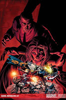 DARK AVENGERS #7
Writer: Matt Fraction
Art: Luke Ross
Marvel $3.99
Stewart R: I’ve had big bones to pick with Marvel for constantly forcing the readership to cope with two different sets of writers and artists when they span a mini-event across two ongoing titles like this, but they’ve done the sensible thing on one count here: they’ve let Matt Fraction do the writing alone. This ensures some consistency and means that his vision is kept intact. Cyclops’ audacious staredown with Osborn is fantastic as each leader tries to put one over on the other. Fraction also goes some way to clarify just where Emma Frost sits with all of this upheaval and it’s refreshing to see that we’re not being handed another simple ‘turncoat’ story. The only concern is that the impending Trask/Sentinel involvement might detract from the mind games and political positioning. 7/10
 SCALPED #30
Writer: Jason Aaron
Art: R.M. Guera
DC/Vertigo
Matt C: A new story arc begins for this peerless series and, judging by the actions of Red Crow in this issue, the shit is about to hit the fan in a big, big way. Of course, I could be utterly mistaken, as one of the great things about Scalped is how Aaron continuously subverts your expectations. With so many doomed characters in such a small narrative sphere you do wonder how long they can last before final judgement reaches them all, but if Aaron can keep juggling these balls in the same fashion he has been over the last couple of years then I’ll keep buying this desolate but mesmerizing book. 9/10
 BETA RAY BILL: GODHUNTER #2
Writer: Kieron Gillen
Art: Kano
Marvel $3.99
Stewart R: The midway point on Bill’s path of revenge sees the worthy Korbinite go up against Galactus’ prime herald, the Silver Surfer. This should be epic sun-shattering stuff but it’s all a little lacklustre in the art department thanks to Kano’s ultra thin style and as a result I feel that the impact of what Gillen is trying to get across has been lost somewhat. That said, the single, bloody-minded nature of Bill’s mission also makes it difficult to warm to the hero's cause, not least because it’s been signposted from the beginning of what the cost might well be. To be honest there are too many other things out there this week to be spending your $3.99 on. 5/10
 ZEKE DEADWOOD: ZOMBIE LAWMAN #1
Writer: T.A Boatwright & Ryan Rubio
Art: Ryan Rubio
SLG $3.95
Matt T: Ah, what a silly little comic to end my reading of the week with. With the cartoony art style, wonderfully hokey Western dialogue, and a less than conventional hero there's plenty to enjoy, and the general outlook of the book is more comedy-horror than horror-comedy. I'm hoping there's more to come from ol' Zeke, as he has plenty of potential to stink out more of the Old West with his putrid style of justice. 9/10
 FANTASTIC FOUR #263
Writer: John Byrne
Art: John Byrne
Marvel $0.60
Matt C: One of my favourite comic book covers ever – it may feature just one character, and one word of dialogue, but it’s such an absolutely electrifying image which conveys so much excitement that even if you weren’t a particular fan of the FF at the time, seeing this on the stands would probably prove to be somewhat irresistible. It is slightly misleading though, in that the contents don’t include a non-stop onslaught of high octane mayhem, but as it features all the traits that made Byrne’s run on the book so great – big sci-fi ideas, engrossing character work, energetic and beautifully rendered art – the lack of continuous action barely registers as you’re propelled along by another brilliantly constructed storyline with a complete doozy of an ending. 9/10

 TOMORROW?
 The message that the book delivers, while hardly original, comes across clearly to the reader: the ‘future’ may not have turned out exactly as we envisaged but things have changed, huge advances have been made, they’ve just sort of snuck up on us without us realising. Just look at the technology we have access to these days: the mobile phone in your pocket is more powerful than the computers that put man on the Moon, and that’s just the tip of the iceberg. The World Of Tomorrow? We’re living in it, bub!


