
While we may not always have the time to review all the comics we get every week, we do try and provide a snapshot of the latest releases, mixing the good with the not so good.
 AQUAMAN #1
Writer: Geoff Johns
Art: Ivan Reis, Joe Prado & Rod Reis
DC $2.99
Mike S: In all honesty, this was the one I was looking forward to the most and I have to say, right off the bat, I loved it. Geoff Johns brings another much maligned character back into the spotlight and in one issue develops the character further than some lesser hacks have done in 12 issues! Ivan Reis produces some stunning artwork, presenting an Aquaman who is both strong and majestic, yet all too human, and a Mera (who I have a soft spot for) who is every bit as fitting as a Queen of Atlantis (or not!) and the issue progresses with a group of villains in the Trench who are genuinely creepy in a Piranha meets The Creature From The Black Lagoon kind of way! A well paced story is divided into three sections: the obligatory hero-in-action-scene, the interacting-with-humanity scene and the Arthur/Mera scene, all beautifully scripted and with some highly entertaining meta-textual referencing too - everyone from cops to robbers to bloggers seem to believe that Aquaman is the joke of the JLA! All in all, this might well be my favourite issue of the entire relaunch (well, those that I have been interested in enough to pick up!) and, with issue #2 promising to focus more on Mera according to Johns, I will most definitely be back! My book of the week, if not the month!! 10/10
Matt C: Of all the Golden Age characters that DC regularly place in the Justice League line-up, it’s Aquaman they seem to have the most difficult time getting a contemporary audience to connect to. The general perception is that he’s a bit of a goofy character and outside the fictional universe he’s regularly the butt of a lot of jokes amongst the fanboy community. So it’s fair to say Geoff Johns faced an uphill struggle with his attempt to make Aquaman ‘cool’ again, and he plays with that perception in this debut issue to prove the point. In fact, he becomes rather preoccupied with it, effectively repeating the point over an over in case we weren’t paying attention the first time. And I understand why he does this but he does it to the detriment of solid plotline manifesting itself. There are hints of where this arc is going – just enough to make me want to come back – but there’s too much of Johns stressing how Aquaman’s actually, like, a really, really cool character. Fortunately Ivan Reis is on hand to effectively display the character in all his pomp and glory, in a way that Johns’ script can’t quite manage replicate. He captures the majesty of the undersea king, emphasising both his strength and nobility with some powerful, detailed linework. This issue’s got me interested in Aquaman in a way I’ve never been before (I’m a Sub-Mariner man myself!) and so long as Johns gets down to business next month rather and lets the character reveal his uniqueness through his actions then this might well develop into something special. 7/10
 ANNIHILATORS: EARTHFALL #1
Writers: Dan Abnett & Andy Lanning
Art: Tan Eng Huat, Andrew Hennessy, Wil Quintana, Timothy Green II & Nathan Fairbairn
Marvel $3.99
Stewart R: After the ‘must try harder’ feeling at the end of the Annihilators miniseries it appears that this new series may have been listening. Abnett and Lanning return to look at the powerful and dangerous Universal Church of Truth as they fight a civil war of sorts within their own ranks, threatening countless worlds in the process, and, as it turns out, threatening the Universe with one secretive plan that draws the powerful Annihilators to Earth. The writers, with the help of Tan Eng Huat on pencils (who has stepped up his game as I hoped), capture a terrific feeling of haste as speed proves to be of the essence and will ultimately lead the heroes into an inevitable showdown with the Earth’s mightiest heroes. Okay, so the ‘lack of communication’ between hero teams premise has been seen many times before, but I reckon DnA have enough in the creative tank to make sure this is something different. I really enjoyed the main story but then there’s the added bonus of a 5-page Rocket Raccoon and Groot backup that pushed an audible chuckle from my lungs and makes this $3.99 well spent. 8/10
 TEEN TITANS #1
Writer: Scott Lobdell
Art: Brett Booth, Norm Rapmund & Andrew Dalhouse
DC $2.99
Mike S: As an old school Teen Titans fan I have followed them religiously, through the good, the bad and the downright diabolical, so this latest variation was greeted with some trepidation. And, to be honest, I am still decidedly on the fence about it. It’s a bit of a slow burner in terms of assembling a team as we are introduced to Kid Flash (who might or might not be Bart Allen), Red Robin and Cassie (Don't call me Wonder Girl) Sandsmark in a quite intriguing storyline that, while not original, could be a good way of introducing others at a more rapid pace. The clandestine N.O.W.H.E.R.E. organisation are suitably mysterious, the artwork is well suited (although too much in a ‘90s style) and the characterisation is interesting enough to bring me back for issue #2. Overall, worth a look, but the final proof of the pudding lays with the first arc to see whether this might become a much loved run of Teen Titans. 6/10
 BRILLIANT #1
Writer: Brian Michael Bendis
Art: Mark Bagley, Joe Rubinstein & Nick Filadri
Marvel/Icon $3.95
Matt C: It takes a lot of balls to call your comic Brilliant as it means you’ve got a grand task ahead of you if you want to live up to the title. Although I’m far from a Bendis fan these days, I’ve really enjoyed his most recent series for Icon, Scarlet, so was hoping lightening may strike twice here. I generally can’t stand his mainstream superhero work, but I can’t deny when he gets it right, he really gets it right (although that doesn’t happen much these days). Sadly, this is another case of him not getting it right though. Even though the pairing of Bendis and Bagley resulted in some of the writer’s most honest and cohesive work for Marvel in Ultimate Spider-Man, the same kind of magic isn’t in evidence here. It’s another superheroes-in-the-real-world tale with nothing really marking it out as unique. Bendis appears to be on autopilot, with his tendency to make all his characters sound the same cropping up repeatedly (pretty much every character says “Oh my God…” at some point) and unfortunately none of those characters are particularly interesting or likeable. You’ll know where you stand on Bagley’s art, but to be honest the ‘darker’ approach he employs here doesn’t really work for his style – he’s more at home in a bright and colourful (visually) environment. Brilliant? Not a chance. 'Boring' would be a more apt title. 4/10
James R: 'Dull' might be a more apposite title! I decided to take a look at this, as there's part of me that still thinks Bendis is capable of greatness, but all I read here was the same frustrations that I'd experienced over the last few years with his writing. His introductory chapter to that now well-worn idea 'What if super-powers existed in the real world' is incredibly lacklustre, with Bendis spending pages and pages introducing us to the players in this tale (who, naturally, all speak in the generic Bendis-voice) and whereas this would be fine normally - I think it's cool to introduce characters in depth before laying into the action - here, they are singularly dull. Their big revelation that they've managed to develop superpowers could have been delivered in one of a hundred ways, but Bendis opted for one that left me singularly uninspired. It reads like a rejected story arc from Heroes - and that's pretty damning for me! 4/10
Stewart R: Okay, I like the idea of top writers keeping things up with the creator-owned projects and for Bendis, Scarlet has impressed me to the point where I’ll give his other independent titles a once over. This certainly starts well with the bank heist scene being a polished affair and a touch creepy to boot. A fair amount in those first few tense pages is left to the storytelling ability of Bagely with his art and he doesn’t disappoint. It’s just a pity that after that start the story gets a touch tiresome as we’re introduced to the group of college friends whose scientific pursuits will lead them to the discovery of super-powers. There are party antics and the inevitable trawl through the cast's introduction one by one. It feels as if Bendis is trying to capture a similar feeling to that of The Social Network, with the protagonists feeling as if they’re meant for more than the path of education they currently find themselves on, but it just comes off as a patented collection of Bendis’ talking heads. The premise is interesting enough to get me back to see if the second issue comes to life now that Bendis has the group established, but if that fails to hit the mark then I’m out. 5/10
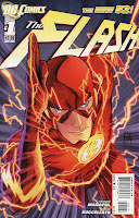 FLASH #1
Writers: Francis Manapul & Brian Buccellato
Art: Francis Manapul & Brian Buccellato
DC $2.99
Matt C: Geoff Johns wasn’t as successful at returning Barry Allen to the DC Universe at first as he was with Hal Jordan, in my opinion at least. Flash: Rebirth didn’t excite in the same way the Green Lantern version had, and the relaunched title, while having some fine moments, wasn’t totally consistent. With Flashpoint though, Johns made Allen feel like a pivotal figure once again so I was kind of disheartened to learn that he wouldn’t be in charge of directing Allen for the New 52. Instead, recent Flash artist, Francis Manapul has been given the opportunity to put words, as well as pictures onto the page (with the help of colourist Buccellatto) and the first thought that sprang to mind was, “Oh no! Not another artist who’s got ideas above his station!”. I was super dubious, but I had to check out this ‘debut’ issue at least and – wow! – Manapul (and Buccellatto!) know how to knock out one heck of an entertaining comic book! Aside from a genuinely intriguing plot (that doesn’t rely on bringing in the Rogues straight off the bat) the key to this issues’ success is that Manapul gets to tailor the script to fit his visual ideas, resulting in some fantastic panel layouts that bristle with invention. They’re not quite up to the high standard of J.H. Williams III, but they’re not that far off either. A great issue and a lovely surprise! 8/10
 SAVAGE HAWKMAN #1
Writer: Tony S. Daniel
Art: Philip Tan & Sunny Gho
DC $2.99
Mike S: While not the easiest first issue in terms of hooking new readers (the supposed reasoning behind the relaunch) this is still good, raising more questions than it answers, and is all the better for it. Carter Hall isn't Hawkman (except he is), he hasn't been Hawkman for a while (except he has) and he doesn't want to be… and yet he is again! The long, convoluted backstory of his origins is, at this point, still as murky - Carter pronounces he was born in the US of A yet the scan reveals alien origins for the tech. But I have faith that, once the run gets underway properly, all will become clear - well, less murky at least! Having said that, I have a brain and a memory that spans more than a goldfish, so I don't mind a bit of convolution in my backstories (hey, I love the X-Men - how much more convoluted can it get?). Tony Daniel produces a good, well-paced script, introducing a myriad of new characters while keeping the focus firmly on Carter and it is complemented by some suitably dynamic art from Philip Tan. 8/10
 GREEN LANTERN: NEW GUARDIANS #1
Writer: Tony Bedard
Art: Tyler Kirkham, BATT & Nei Rufino
DC $2.99
Stewart R: With there now being four DC titles in the New 52 dedicated to various Lanterns and Corps there’s really not much room for any ‘mediocre’ comics in this initial run. Unfortunately this looked to be the weaker one from the solicitations and it’s proven to be the case on the day. A third of the page count is given over to an origin recount of how Kyle Rayner ended up as a Lantern, which, to knowledgeable readers - and I’m going to assume that 90% of people who picked this up are Green Lantern fans already - will grate a little and for the uninitiated, well they may not even realise that it’s a flashback as it’s not fully made clear until halfway through the book! I’m going to assume that this retreading of old story has been included as Ganthet’s reasons for picking Kyle all those years ago have never been fully revealed and Bedard is going to explore that selection through this series. What then follows is a dash around the galaxy as the rings of various corps members start to leave their owners, often with devastating results for the former bearers, before things explosively gravitate towards Kyle on Earth. That sounds fairly exciting but unfortunately Kirkham and BATT’s pencil and ink work is not up to the task of making this simple idea look spectacular and I’ve come away very underwhelmed by this #1 on the whole. 4/10
 ALL-STAR WESTERN #1
Writers: Jimmy Palmiotti & Justin Gray
Art: Moritat & Gabreil Bautista
DC $3.99
Matt C: Fancy seeing Jonah Hex arrive in Gotham as its just establishing itself as a major city, looking for a Jack The Ripperesque killer with the aid of a Doctor Amadeus Arkham? Step this way! The title of the book might suggest cowboys, saloons and shootouts in dusty towns out West, but Palmiotti and Gray have decided to offer something quite different, resulting in a rather wonderful comic that contains many of the tropes of the Western genre but attaches them to a Victorian murder mystery plot. Running throughout is Arkham’s voiceover examination of Hex’s psyche, and while he initially pegs him as an amoral killer, the more he spends time with him the more apparent it becomes just what a complicated and contradictory character Hex is. It’s astutely written and Moritat’s art generally captures the era of the 1880s with panache (a couple of wonky panels aside) and there are some nice ties to the recent Batman: Gates Of Gotham series for eagle-eyed readers to spot. After the done-in-one storylines of their Jonah Hex series, Palmiotti and Gray look to be taking the multi-part arc approach with this series, and if the quality’s at the same standard as this debut issue, I’ll definitely be along for the ride. 8/10
James R: So far, the DCU relaunch has gone pretty much to form - the writers and artists who I expect great things from (yes, I'm looking at you Messieurs Lemire and Snyder!) have delivered the goods in spades, and the books that I thought looked a little ropey (cough, Catwoman, cough) have also turned out to be so. However, the last week of releases has yielded up two big pleasant surprises, and this was my pick of the bunch. I never had much time for Jonah Hex before, seeing him as quite a 2D western stereotype, and an abysmal movie adaptation certainly didn't help me warm to him. My view started to change somewhat with an outstanding standalone issue written by Gray and Palmiotti and illustrated by Lemire, when Hex tracked down his no-good Poppy, and watched him slowly expire. After that taste, I thought it would be worth my two bits (or my $3.99) to invest at the relaunch of a Jonah Hex book. It appears that I gambled wisely! This is a corking read with a serial killer loose in 19th century Gotham and our tale narrated by Amadeus Arkham, who is forced into an uneasy partnership with the infamous manhunter Jonah Hex. Already an anachronism within his own time (the Gothamites are startled by his Confederate Army uniform) he remains a man who knows how to get things done. This book is like a broth of excellent tropes: the grizzled western hero, the serial killer tale, the DC Universe/Batman nods... it hangs together beautifully. The art from Moritat is almost spartan in places, but he does a great job of conveying the urban sprawl and the violent world of Hex. An absolute win of a first issue and I hope this gets the audience it deserves! 9/10
 BATMAN: THE DARK KNIGHT #1
Writers: Paul Jenkins & David Finch
Art: David Finch, Richard Friend & Alex Sinclair
DC $2.99
Stewart R: The Batman titles I’ve picked up so far this month have been of very high quality and while this doesn’t reach the heady heights of its competition, it’s not a bad start. Jenkins and Finch build slowly with Bruce Wayne once again trying to sell his vision of the future for Gotham, being introduced along the way to an Internal Affairs agent who will no doubt prove to a thorn in his and Jim Gordon’s side, and an attractive, young woman who we’ll no doubt get to see more of too. With the Bruce section of the comic out of the way, these creators then haul us quite willingly over to Arkham Asylum where Finch gets to flex his artistic muscles. Up to that point in the issue I’ll admit that his character facial work was looking a touch bizarre but things seem to improve markedly as soon as we catch the first glimpse of the cape and cowl as the inmates go berserk with Batman leading the guards in trying to get things back under control. I will say that it seems a touch strange that the editorial team at DC allowed two Bat-books to involve two Arkham riots in this first month and to be honest there’s too many similarities to Scott Snyder’s first issue here to make it feel like anything special. It has my interest for now but really has to branch out on its own quickly to maintain it. 7/10
 JUSTICE LEAGUE DARK #1
Writer: Peter Milligan
Art: Mikel Janin & Ulises Arreola
DC $2.99
James R: Well, it's a terrible title - it just makes me think 'Justice League Extreme!' or 'Justice League Goth!' But don't judge it on the title, this book is a revelation! I decided to pick this up as I've found that the other 'Dark' (Ugh!) books from DC - Animal Man, Swamp Thing & Frankenstein - have been the highlights of the relaunch, and I have a great deal of faith in Peter Milligan as a writer. What he delivers with Mikel Janin is a grand introductory issue. It reminded me in places of both Xombi and Grant Morrison's Doom Patrol and that's to be taken as high praise indeed. This opening shot introduces us to our team - characters from the DCU who have magical leanings or abilities - and we quickly see that they step in whenever the rather magic-vunerable Justice League find themselves out of their depth. Beyond the introductions and the threat of the Enchantress, there's little time for the team to interact (or even get together!) but there's ideas a-plenty on show here, and like their 'regular' JL counterparts, this first issue points at great things to come. A tasty entree, and no mistake! 8/10
Matt C: I’ve never had much of an interest in comics that deal with ‘magic’, the characters involved here I can take or leave, and Milligan is a writer I’ve never felt any particularly allegiance to, so what the hell am I picking this book up for? Well, it’s was one of those last-minute purchases prompted by the fact that the title contains the words “Justice League” and “Dark” in it, the cover’s by Ryan Sook (not his best, admittedly) and I’ve been generally more willing to take a risk with these New 52 titles. To be honest, I wasn’t expecting to go a bundle on this book due to the aforementioned reasons but – whaddya know! – this is actually a very good opener indeed. The introduction to the characters is handled admirably - it’s easy enough to get to grips with who’s who but Milligan approaches it with enough intelligence and subtlety that you get the sense old time fans won’t be displeased by what they see. Add to that the fact that all the characters involved seem to be damaged to one degree or another and you have a pretty enticing proposition for those who like their comics, well, er, dark! The art is impressive, the splash credits page being the highlight even though some may have issues with the presentation of the regular Justice League (although that may be the costumes rather than the rendering). I never figured I’d be back for issue #2 of this title but I think that’s been part of the joy getting involved in the New 52 – some of the titles that I’ve enjoyed the most are ones that I initially had no intention of buying. This is one of those titles. See you next month for another helping of messed up mystical mayhem then! 8/10
 FEAR ITSELF: THE DEEP #4
Writer: Cullen Bunn
Art: Lee Garbett, David Meikis, John Lucas, Rick Magyar & John Rauch
Marvel $2.99
Stewart R: It feels to me that the tie-in titles for the Fear Itself event have been carrying much of the emotional legwork and The Deep has really impressed. Bunn has done an superb job of showing the usually unflappable Namor appear pensive and vulnerable in the face of an enemy who has struck close to the Atlantean’s home and heart. I really like the first two pages in this final issue that has artist Lee Garbett showing single moments of fear or trepidation that Namor’s fellow Defenders have had to face in their past alongside the Atlantean Kings inner thoughts on facing his darkest concerns. From there, Bunn and Garbett deliver a thrilling fight sequence as the Defenders take on the mighty hordes of Attuma’s forces, the balance of the battle to-ing and fro-ing in dramatic style. While, to some degree, the climax here is predetermined by the events that took place at the end of Fear Itself #6, there thankfully remains a certain element of surprise that really does hold the interest up to the final page which allows me to dub this a damn fine Fear Itself read! Fraction and Dodson’s upcoming Defenders ongoing series may get a cautious look from me but had it been Messrs Bunn and Garbett on board it would have been a definite lock into my pull-list. 8/10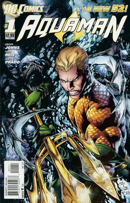
3 comments:
Some nice reviews there guys,can't say I disagree with any of them that much,but lets not go there again [yet],as for me I really enjoyed I Vampire,nice to see that back after just being a back-up strip in House of Mystery many moon's ago,and over all having read all of the DC 52 there was not one comic that didn't make me feel it wasn't worth coming back for issue 2,so that's 52 new ongoing titles now on my standing order,mad you say,some people out there seem to think I am,but I'm just a lover of comics that enjoys them for what they are,pure escapism and as we know I just don't take them as seriously as some seem to do,so all I need now is for DC to bring back The Big Cheese Captain Marvel and then I'll be a happy little comic collector.
Wow yet again no reply to my posting,makes a guy think he's being deliberately ignored,well one of my postings was taken of this site so what did I expect,and here I was thinking the reviewers on this site were a nice bunch of guys,well that's what I've been told anyway,but it would seem that if you disagree with a reviewer or god forbid have an opinion that causes a little debait you get ignored,so in summery if this is how fanboys react to other fanboys thank god I'm out here on my own,no wonder we have a crap reputation with joe public,feel free to rant back.
unless you like rocket raccoon all your going to get is 20 pages of Annihilators reading for 4 bucks. yeah i don't think so i'm done with this series.
Post a Comment